Evolution of NetSuite's Interface: The Redwood Experience
Redwood Experience: Evolution of NetSuite’s Interface for CFOs and Administrators
What is the Redwood Experience Interface?
Redwood Experience refers to Oracle’s next-generation user interface (UI) and user experience (UX) design system, now being applied to Oracle NetSuite and other Oracle Cloud applications. In essence, Redwood is a modern design language and framework that Oracle introduced to transform enterprise software into a consumer-grade experience[1] (Source: erp.today. Instead of the dated, text-heavy screens historically seen in business applications, Redwood provides a unified, intuitive, and visually appealing interface across Oracle’s product suite (ERP, CRM, HCM, etc.) (Source: erp.today. Within NetSuite – Oracle’s cloud ERP platform – the Redwood Experience manifests as a new theme and UI overhaul that reimagines how users interact with the system on a daily basis. It’s not just a reskin; Oracle describes Redwood as “much more than an updated user interface… a complete rethinking of how a business system can embrace better workflows, intelligence, and automation”[2].
In context: Oracle launched the Redwood design system in 2019 as part of a company-wide initiative to modernize UX[3]. Initially, Redwood was rolled out in Oracle Fusion Cloud Applications (the enterprise ERP/financial suite) and Oracle’s corporate branding. Now, that same design philosophy – spearheaded by Oracle’s UX leaders Hillel Cooperman and Jenny Lam – is making its way into NetSuite, which Oracle acquired in 2016. For NetSuite users, Redwood Experience means the interface of the ERP will look and behave more like a modern web application, aligning with the usability of popular consumer apps. This includes fresh visuals, responsive design, and embedded intelligence. Ultimately, Redwood aims to “deliver on heightened expectations” by treating each user interaction as an opportunity to delight and to change perceptions of what business software can do[4].
Historical Development: From Classic NetSuite UI to Redwood
Legacy NetSuite UI: NetSuite was a pioneer of cloud ERP (founded in 1998), and its interface has evolved gradually over the past two decades. Older versions of NetSuite’s UI were functional but often perceived as outdated and clunky, with dense menus and forms typical of early 2000s web software. Through the 2010s, NetSuite refreshed the look in small ways (e.g. introducing SuiteAnalytics Workbooks, slight theme updates, and more drag-and-drop dashboard widgets), but the overall design paradigm remained similar. Users grew accustomed to a blue-grey navigation bar, tabbed records, and list pages with many filters and subtabs. While powerful, the classic UI had a steep learning curve and was not initially designed with mobile devices or modern UX principles in mind.
Oracle’s Redwood initiative (2019): A major turning point came when Oracle – having acquired NetSuite – launched the Redwood design system at Oracle OpenWorld 2019[5][6]. Oracle’s goal was to reshape its image through design, creating a cohesive and coherent experience across all customer touchpoints[7]. This was a multi-year effort led by experienced designers (Cooperman and Lam, known for their work at Microsoft) and represented a fundamental shift: Oracle decided to make world-class UX a differentiator for its enterprise products[8]. The Redwood style debuted in Oracle’s flagship cloud apps (like Fusion ERP, HCM, SCM) around 2020 and won awards for its user-centric approach[1]. Key characteristics included minimalistic layouts, a new iconography set, adaptive panels, and an emphasis on personalization and accessibility.
Arrival of Redwood in NetSuite: Oracle’s vision was to unify UX across its cloud offerings, and NetSuite is a critical part of that portfolio. The first hints of Redwood in the NetSuite ecosystem appeared in ancillary products: for example, NetSuite Planning and Budgeting (NSPB) and NetSuite Analytics Warehouse adopted Redwood-styled interfaces (since these tools are built on Oracle’s EPM and analytics platforms)[3]. By 2023, NetSuite users saw glimpses of Redwood in certain pages or SuiteApps, but the core NetSuite application (ERP transactions, records, dashboards) still used the older UI.
Major redesign announcements: In September 2024, at the SuiteWorld annual conference, Oracle NetSuite formally unveiled the plan to roll out the Oracle Redwood Design System across the entire NetSuite application suite[9]. This was framed as a significant change for NetSuite’s 40,000+ customers. Evan Goldberg (NetSuite’s founder) described the new UX as a “more natural extension of your everyday work”, noting that Redwood was originally created for Oracle’s cloud apps and was now being applied to NetSuite[10]. Starting with the most commonly used areas – dashboards, lists, and forms – Redwood would gradually permeate NetSuite’s UI[3][11]. Oracle emphasized that this would be a phased journey, not an overnight switch, to ensure customers could adapt smoothly.
Release timeline and evolution: Redwood’s introduction into core NetSuite has been incremental, aligned with the biannual release cycle:
-
2024 Release 1: Early previews of Redwood elements (for example, some SuiteNavigator pages or optional beta features) began appearing. Oracle also encouraged customers to try out Redwood concepts via theme settings in Release Preview accounts.
-
2024 Release 2: NetSuite 2024.2 officially introduced the “Redwood Experience” theme as an option for all users. Administrators could enable this new theme, giving NetSuite an immediate facelift with Redwood colors, icons, and fonts[12]. The release notes highlight that this refreshed UI offers a “sleek, contemporary design that improves navigation and usability.” Key features included updated page headers and the ability to collapse/expand field group sections on forms (a long-requested usability improvement)[13]. Essentially, 2024.2 laid the groundwork by offering Redwood as a theme that customers could toggle on, signaling the beginning of the transition.
-
2025 Release 1: By 2025.1, Redwood had progressed significantly. The new theme was expanded to additional pages, portlets, and features throughout NetSuite[14]. For instance, previously unsupported areas like the Reports page, Saved Search results, Analytics (Workbooks interface), Setup Manager, and even the Help Center all received Redwood’s design treatment[15]. Oracle’s release documentation notes that Redwood is now the default experience for all new NetSuite accounts provisioned (as of early 2025)[16]. This means new customers come on board directly into Redwood, underscoring Oracle’s confidence in the new UX. Existing accounts can still switch back if needed, but Oracle is gathering feedback – a questionnaire now appears when disabling Redwood, indicating Oracle’s intent to continually refine the experience[17]. By 2025, Redwood isn’t just a concept; it’s the standard moving forward, with Oracle planning to complete the rollout to remaining areas and fully replace the legacy UI.
Beyond 2025: Oracle’s commitment to Redwood extends across its application ecosystem. In fact, Oracle has an ongoing UX modernization timeline through 2025 for various products[18]. For NetSuite, this likely means continued enhancements in each release: more pages converted to Redwood, performance optimizations, and tighter integration of AI-driven features into the UI. In short, the Redwood Experience interface is not a one-time project – it represents a continuous evolution of NetSuite’s look and feel. From the decades-old classic interface to today’s Redwood design, we see NetSuite joining the forefront of enterprise software UX, aligning with Oracle’s broader strategy to make enterprise apps “as easy to use as consumer software”[19].
Innovations Introduced by Redwood UX
The Redwood Experience brings a slate of UX innovations and new features that fundamentally improve how users navigate and utilize NetSuite. Below we break down the key enhancements in terms of design, navigation, automation, and personalization:
-
User-Centric, Consumer-Grade Design: Redwood was built with a “customer-first mindset,” meaning the design process started by understanding real users (like finance professionals) – what they need to accomplish and where traditional software slowed them down[20]. As Mike Remington, GVP of Experience Design at NetSuite, put it, Redwood strives for technology to adapt to the user, rather than forcing users to adapt to technology[21]. In practice, this means the interface is clean and approachable. It looks more like a modern app you’d use on your smartphone or tablet, rather than an old enterprise system. Oracle’s aim was to make working in NetSuite feel “as good or better” than using popular consumer apps[19]. This paradigm shift is evident in every visual aspect: a neutral color palette, modern sans-serif typography, higher information density where needed but with ample whitespace, and an overall reduction in on-screen clutter. The design system also ensures consistency – once you learn the Redwood style in one Oracle product, that knowledge carries over to others, reducing the learning curve.
-
Modern Look and Feel: The first thing users notice with Redwood is the refreshed aesthetic. The theme introduces new colors and icons that are not only visually pleasing but also functional. For example, Redwood’s icons and status indicators are designed to be easily recognizable at a glance, aiding quick comprehension of data. The page headers and navigation bars have a sleek, flat design with subtle shading. According to Oracle’s release notes, the Redwood theme in 2024.2 delivered a “modern look and feel” that immediately makes NetSuite feel more contemporary and “user-friendly”[22]. The interface has been compared to popular web applications in terms of responsiveness and clarity. Additionally, Redwood is an “award-winning” design system[1] – it incorporates best practices from UX research, including attention to accessibility (e.g. color contrast suitable for those with low vision or color blindness) and support for different screen sizes.
-
Enhanced Navigation: Redwood dramatically improves navigation within NetSuite:
-
Sticky Headers and Search: The main header and navigation menu now remain fixed at the top of the screen as you scroll[23]. This means that important controls (like the navigation menus, search bar, and quick actions) are always one click away, even if you’re far down on a long page. The global search box is prominently centered in the header for easy access[24]. In Redwood, this search is more visible and can handle more natural queries (especially with the Ask Oracle enhancement – see below). For busy CFOs or admins who constantly jump between clients, transactions, and reports, having the search omnipresent is a big efficiency booster.
-
“Create New” Menu: A new addition to the header is the Create New menu (or button), which is always accessible on the top-right[25]. This menu allows users to quickly initiate the creation of common records (like a new transaction, customer, vendor, event, or task) from anywhere in the system. Previously, you might have had to navigate into a specific module or use a shortcuts portlet to add a new record. Now, Redwood provides a one-click route to add data, which is further personalizable – administrators can configure which quick-create options appear, tailoring it to the organization’s needs[25]. For example, a sales manager might see “New Lead” and “New Opportunity” in their Create New, while a CFO might see “New Journal Entry” or “New Budget”.
-
Larger, Responsive Menus: The top navigation menus (the main modules like Transactions, Financial, Reports, etc.) in Redwood are larger and more touch-friendly than before[26]. The text is larger with more spacing, and menus open on hover without requiring a click (the little drop-down arrows were removed)[27]. This not only saves a click, but on touch devices (like tablets) a simple tap opens the menu. Redwood’s menu bar is also responsive: if your browser window is too narrow to display all menu tabs, an ellipsis (
…) appears at the end of the menu bar, indicating more options are hidden. Hovering or tapping that reveals the overflow menus[26]. This is a significant improvement for mobile and small screens, ensuring users can still reach all modules without excessive scrolling or horizontal panning. In short, Redwood’s navigation is designed for flexibility – whether you’re on a desktop with multiple monitors or on an iPad, the menus adjust gracefully to keep everything within reach.
-
-
Streamlined Dashboards: NetSuite’s dashboards (home pages with portlets of information) get a usability boost under Redwood:
-
Progressive Disclosure: Redwood embraces the UX concept of progressive disclosure, meaning advanced or secondary options remain hidden until needed, thereby decluttering the view. On dashboards, this is seen in how portlet controls and details appear only on hover[28]. For instance, a “Recent Records” portlet in Redwood shows a simple list by default, but when you hover your cursor over it, additional options surface: the portlet’s menu icon appears, the record under the cursor gets underlined (indicating it’s clickable), and an inline “Edit” link might show to edit that record directly[29]. When your mouse moves away, those extra indicators fade out, leaving a clean list. This dynamic behavior makes dashboards look much less cluttered while still providing full functionality on demand. Oracle’s own guidance notes that Redwood dashboards “look a lot less cluttered” than before due to these design changes[28].
-
Collapsible Portlets: Users can now minimize any portlet by simply clicking its title bar (and click again to expand)[30]. This is helpful if, say, a CFO has a portlet for “News” or “Training videos” that they only occasionally need – they can collapse it to save screen real estate and expand it when required. In the past, portlets could be removed or resized, but not collapsed in place; Redwood adds this flexibility for a more organized workspace.
-
Improved Personalization UI: Redwood introduces a new way to personalize dashboards. Clicking the “Personalize” button (now clearly visible in the top-right of the dashboard) slides open a Personalize Dashboard panel[31]. From there, users can easily add portlets by category (Standard Content, Report Snapshots, Trend Graphs, etc.) via drag-and-drop or a one-click plus (
+) icon. Removing portlets is just as visual – a “Currently Used” section shows your active portlets, and hovering over one highlights it on the dashboard and offers a remove (x) button[32]. The Layout button allows switching the dashboard column layout with immediate preview (note: Redwood supports up to three-column layouts, requiring sufficient screen width)[33]. All these enhancements mean that customizing dashboards is simpler and more WYSIWYG (what-you-see-is-what-you-get). Finance executives can tailor their NetSuite home pages without needing technical help, arranging KPI metrics, reminders, and graphs in an optimal way for their priorities.
-
-
Improved Forms and Lists: Data entry forms (like invoices, purchase orders, employee records) and list pages (like saved search results or transaction lists) have been reworked for efficiency:
-
Collapsible Field Groups: Perhaps one of the most welcome Redwood features is the ability to collapse sections within record forms[34]. NetSuite records often contain multiple sections (for example, a vendor bill might have “Primary Information”, “Classification”, “Accounting”, “Items”, “Expenses”, etc.). Previously, all sections were expanded by default, and long forms could require a lot of scrolling. In Redwood, each section can be toggled open or closed. Users can focus on what matters and temporarily hide the rest. For instance, a CFO reviewing an Invoice record might collapse the Item Line Details section if they only care about the total amount and approval status. Or an admin editing an Employee record could collapse personal details when just updating roles and permissions. Collapsible sections make the UI more manageable, maximizing on-screen information density without overwhelming the user. It’s a direct response to user feedback for a more organized view of complex records[35].
-
List Filters and Controls Relocated: In list pages (like a list of transactions, customers, or search results), Redwood moves all controls that used to be at the bottom of the list (filters, page navigation, export buttons) to the top of the list[36]. This change aligns with most modern web applications and is simply more convenient – users often set filters at the top, so having them visible without scrolling down makes sense. Moreover, Redwood places list filters into a collapsible panel at the top of the page[36]. By clicking a filter icon or bar, you can show/hide the filtering options. This again reduces visual noise when you’re just scanning the list, but allows you to quickly adjust criteria when needed. As a result, whether you’re looking at an Accounts Payable aging report or a list of open sales orders, Redwood gives you a cleaner list view and quicker access to filtering and actions like edit, sort, or pagination. In short, list pages become more efficient and user-friendly under Redwood.
-
Contextual Menus and Buttons: Redwood also introduces subtle UX improvements like on-hover action buttons in lists. For example, when you hover over a transaction in a list, you might see a little “Edit” link appear or a menu with actions (View, Edit, Approve, etc.). This saves you from clicking into each record or checking boxes and using an action menu, which was the old method. It’s part of Redwood’s “show controls when relevant” philosophy, streamlining workflow actions.
-
-
Embedded Intelligence and Automation: One of Redwood’s defining features is how it integrates intelligent assistance directly into the UI rather than treating it as an add-on. Oracle has embedded AI and machine learning (ML) capabilities in various parts of NetSuite’s Redwood experience:
-
Ask Oracle – Conversational Search: Redwood’s approach to search goes beyond keywords. NetSuite is introducing Ask Oracle, a powerful search tool that leverages generative AI to let users ask questions or make requests in plain English[37]. For example, a CFO might type (or even speak) “Show me total sales by region for Q3” or “Create a new expense report for $500 Office Supplies”. The system will understand the intent and either retrieve the data or initiate the action. This is a huge leap from traditional search, effectively acting as a built-in digital assistant. Ask Oracle can find data and execute tasks across NetSuite based on natural language input[37]. Under the hood, it uses Oracle’s AI models to interpret user queries and surface the right information (even spanning multiple record types). This kind of capability significantly benefits CFOs who need quick answers, or any user who isn’t sure where a certain report or function is in the menu – they can simply ask.
-
Text Enhance – AI Writing Helper: Redwood embeds generative AI in text fields through a feature called Text Enhance. Whenever you’re typing a description, memo, or any long text in NetSuite, you can invoke AI-powered actions like Make Shorter, Make Longer, Fix Spelling/Tone, or even Generate content[38][39]. For instance, if an AR clerk is writing a dunning email to a customer, they could select the draft text and click Enhance Text -> Make Polite, and the AI will refine the wording. Or when creating a job requisition, there’s an option to Generate a posting description automatically using AI[40]. Administrators can even customize these AI prompts using a Prompt Studio (a low-code tool) to define what the AI should do[41]. This tight integration means Redwood isn’t just about looking nicer – it actively helps automate and improve the quality of user input. CFOs might use it to summarize lengthy financial commentary, and finance teams can ensure consistent language in communications, all within the NetSuite UI.
-
Smart Recommendations and Notifications: Redwood brings more contextual intelligence to the forefront. For example, NetSuite now can display “Recommendation Messages” at the top of pages[42]. These might inform users of a feature they haven’t used (e.g., “Try the new Cash 360 dashboard for better cash forecasting”) or suggest an action (“You have 5 vendor bills pending approval”). These messages can be dismissed or turned off, but they serve to guide users proactively, which is especially useful for busy executives who might miss new functionality. Additionally, Redwood is built to be the delivery mechanism for generative AI insights. One analyst noted that the move to Redwood “can also serve as the delivery vehicle for new generative AI capabilities” in NetSuite[43]. This implies as Oracle develops AI features (forecasting, anomaly detection, digital assistants, etc.), Redwood’s interface is where those insights will appear – whether it’s a dashboard widget that highlights an unusual expense trend, or a chatbot that asks if you want to auto-categorize transactions at month-end.
-
Automation of Workflows: While not solely a UI feature, Redwood’s philosophy of embedding intelligence extends to automation. NetSuite has added more AI/ML-driven automation (for instance, Bill Capture, which scans and codes vendor bills, or cash reconciliation algorithms). Redwood’s role is to make these automations visible and easy to control. For example, a dashboard might show an AI-driven “tasks completed for you” summary, or an approval page might pre-fill recommended approvers based on AI. Redwood treats AI elements as a natural part of the UI. As Oracle’s UX chief Cooperman highlighted, “AI is not just bolted on to NetSuite but embedded in the application wherever it can provide the greatest value”[44]. This is a stark change from legacy designs where any AI or advanced analytics felt separate. In Redwood, if an algorithm flags something important (say a project that’s likely to go over budget), the interface itself draws your attention to it in the moment, rather than burying it in a report.
-
-
Consistency and Personalization: Redwood also introduces features that enhance personal and organizational consistency:
-
Unified Experience Across Modules: Redwood is implemented across all NetSuite modules and subsidiary applications (eventually), meaning whether a user is in financials, CRM, or HR, the experience is consistent. This uniformity reduces mental load – a sales VP and a CFO using different parts of NetSuite will see a common style and interact with similar UI patterns. Oracle notes that this homogeneity is a win for customers, as even using Oracle Fusion Cloud and NetSuite side by side could feel seamless with Redwood (the same UX across both)[45]. This is particularly relevant for larger organizations where different divisions might use different systems; Redwood erases some of the friction between them.
-
Role-Based Color Themes: A subtle but helpful feature: Redwood allows users to change the color theme of the header based on their role[46]. For example, if someone often switches roles in NetSuite (say from CFO role to Administrator role to do setup work), they can set each role to have a distinct highlight color visible on the top bar. This visual cue helps prevent confusion about which role’s permissions/view they are using at any time. It’s a small quality-of-life improvement that can prevent mistakes (like thinking you’re in your admin role and making changes, when actually in a limited role).
-
Environment Distinction: Similarly, Redwood color-codes different account environments – production, sandbox, development, etc. – by adding a colored strip or banner in the header[47]. NetSuite administrators often juggle multiple environments (to test changes or run a Release Preview). Now, at a glance, they can tell which environment they’re in (for instance, Production might have a blue strip and Sandbox a green strip). This reduces the risk of doing something in the wrong environment and is a simple but effective safeguard introduced with Redwood.
-
Personal Preferences and Opt-In: Redwood gives individual users some control. They can opt into the Redwood theme (during the transition phase) via Home > Set Preferences > Appearance. Oracle has provided options to toggle Redwood on or off at the user level and capture feedback if someone opts out[17]. Over time, as Redwood becomes the norm, these toggles may disappear, but during evolution, it’s a considerate approach to accommodate user comfort while gathering data to improve the UX. This reflective, user-driven iteration is part of Redwood’s rollout DNA.
-
In summary, Redwood brings significant UX advancements to NetSuite: a polished interface, more fluid navigation, clever use of AI for automation, and thoughtful touches that personalize and streamline the work experience. It’s a leap from the purely functional design of legacy ERP to a more intelligent and engaging interface, directly addressing the needs of modern CFOs and ERP administrators. Oracle’s aim is that by embedding these innovations, NetSuite users can work smarter, faster, and with greater satisfaction, letting the software work for them rather than the other way around[48].
Redwood vs. Legacy NetSuite Interface: Key Differences
Many CFOs and NetSuite administrators who have been using the system for years will naturally ask: How does the new Redwood experience actually differ from the familiar (but old) interface? Let’s break down the key differences between Redwood and the legacy NetSuite UI, with practical examples relevant to finance teams and admins:
-
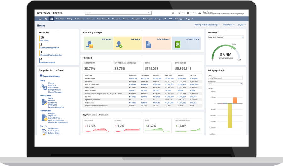
Visual Refresh and Clarity: The most immediate difference is visual. Redwood’s interface is clean, light, and modern, whereas the legacy NetSuite UI (often called “Classic” or “Standard” theme) had a more dated, utilitarian look. In the old interface, screens were packed with information, bordered by dense menus and sublists. Redwood introduces a “sleek, contemporary design” that is not only aesthetically pleasing but also functionally clearer[22]. For example, in Redwood the fonts are larger and easier to read on high-resolution displays, icons are updated for quick recognition, and there’s more whitespace to separate sections of the screen. A finance dashboard that in the old UI might have been a collage of portlets and text now appears far more organized in Redwood: important KPIs are front and center with bold numbers and sparklines, while less critical info is toned down or tucked away until needed. The result is a less cluttered look, which reduces eye strain and cognitive load. Users have noted that Redwood “provides a refreshed look with new colors, icons, and fonts” that make NetSuite feel like a brand-new application[49]. This clarity is especially beneficial for CFOs who deal with complex data – spotting a trend or anomaly on a Redwood dashboard (with its improved charts and color cues) is easier than on the older dashboards.
-
Navigation and Menu Behavior: Redwood overhauls how users navigate NetSuite:
-
In the legacy UI, the top navigation was static; you clicked on menu headers to reveal dropdowns (with a slight delay), and on smaller screens these menus could get cut off or require horizontal scrolling. In Redwood, all menus expand automatically on hover (no extra click needed) and the menu bar intelligently handles small windows with an overflow indicator[27]. This dynamic behavior means fewer clicks and smoother transitions. For example, an ERP administrator switching between Lists > Employees and Reports > Financial > Income Statement can now just flick the mouse across the menu bar – the menus open as the cursor passes over them. It feels instantaneous compared to the old click-and-wait.
-
Redwood’s global search being permanently visible is a huge UX win. In the old UI, the search box could be hidden if you scrolled down, and users sometimes didn’t even notice the small search bar in the corner. Now it’s big, centered, and even says “Search” as a prompt – inviting users to utilize it. CFOs who might have struggled to find a specific report in menus can simply type keywords. And with Ask Oracle capabilities, Redwood’s search goes beyond what the legacy search could do (which was limited to record keywords).
-
The addition of the Create New menu in Redwood is another differentiator. In the past, adding a new entry (say a journal entry) meant navigating: Transactions > Financial > Make Journal Entry. With Redwood, a CFO or controller can hit the “+ New” (Create New) button and select Journal Entry, no matter where they are in NetSuite. It’s a small reduction in steps that, over hundreds of uses, saves a lot of time and makes the system feel more responsive to the user’s needs[25]. For administrators, there’s satisfaction in knowing users can help themselves more easily, and training new users becomes simpler (one menu to create anything vs. remembering different navigation paths for different records).
-
-
Dashboards and Data Visualization: Redwood dashboards differ from legacy dashboards in both form and function:
-
Legacy dashboards tended to show everything at once – portlet titles, menus, refresh icons, etc., were always visible. For a CFO’s “Executive Dashboard” with maybe 10-15 portlets (KPI meters, reminders, trend graphs, reports, etc.), this could be visually overwhelming, and many users would refrain from fully populating their dashboard for fear of clutter. Redwood dashboards address this by showing controls only on interaction. As noted, portlet menu icons and “Edit” links appear on hover[29], meaning when you just glance at your dashboard, you see information (numbers, charts) with minimal buttons. It “looks a lot less cluttered”[28]. So a CFO’s Redwood dashboard might show a clean revenue trend graph and a Key Performance Indicators portlet with just the metrics; the edit/configure buttons for those portlets stay hidden until the CFO actively wants to change something. This invites finance users to load up their dashboard with all relevant info, confident that it will remain readable.
-
Redwood also introduced collapsible portlets and sections which legacy dashboards didn’t support. For example, the “Reminders” portlet (showing tasks like approvals to do) could be minimized in Redwood – in the legacy UI, you could remove it, but not hide/show it dynamically. Now a CFO can collapse the Reminders when not needed, or an admin can collapse an “Announcements” portlet after reading it, keeping the dashboard tidy.
-
When it comes to visualization: Redwood’s influence extends to using Oracle JET (JavaScript Extension Toolkit) for more advanced charts and pivot tables (as seen in the Analytics/Workbook area). This means faster rendering and more interactive charts than the old interface could support[50]. While core financial reports in NetSuite remain table-based, Redwood’s style makes even those easier on the eyes, and any charts (like those in the KPI Meter or Trend Graph portlets) adopt the new design language, which is more modern (flat design, gentle animations, etc.). For a CFO, these improvements mean that the story behind the numbers is conveyed more intuitively – a quick glance at a Redwood chart might show a revenue spike with a bright highlight, whereas before you might have to interpret a less prominent graphic.
-
-
Forms and Transaction Processing: Day-to-day transaction entry and review is transformed in subtle but impactful ways:
-
Example (Finance team): Take the Vendor Bill entry screen. In the classic UI, all fields – header info, item lines, expenses, accounting, approval status – are on one long page. A payables clerk might have to scroll past a lot of fields they don’t use (like memo, custom info, etc.) to get to the line items. In Redwood, sections like Accounting (GL posting details) or Expensed Items can be collapsed if the bill is simple. The clerk sees just what they need (e.g. vendor, date, amount, and the expense line), filling it out faster and with less chance of missing a field. Meanwhile, a CFO reviewing that bill for approval could collapse everything except the summary and the approval button, quickly making a decision. In the old UI, the CFO might be confronted with a full page of fields and potentially get distracted or need to double-check details. Collapsible sections in Redwood directly address information overload, letting each role focus on what matters for their task[34].
-
Example (Administrator): Consider an admin customizing a Saved Search (report). In the old UI, the search results had filters at the bottom and editing the search criteria meant scrolling back up and clicking Edit. Redwood moves filters to the top in a collapsible panel, as mentioned, and keeps the list controls visible at top[36]. So if an admin wants to refine a search, the filters are right where they expect – no more scrolling past possibly hundreds of results to tweak criteria. This makes analyzing data more efficient. Also, Redwood’s consistent placement of buttons (like Export, Email, etc., now likely at top right) means less hunting around the screen.
-
Efficiency and Errors: The Redwood UI’s improvements also reduce user errors. For example, the role/account color banners help prevent the common mistake of performing actions in the wrong role or environment (e.g., an admin accidentally editing a production record thinking they were in sandbox)[47]. In legacy NetSuite, the visual difference between accounts was minimal – just a small text in the corner. Redwood’s bold color cues lower that risk significantly. Similarly, having important menus always visible (thanks to sticky headers) means users are less likely to get “lost” on a page and wonder how to navigate – a big plus for new users or occasional users like department managers who only log in periodically.
-
-
User Empowerment (Customization & Personalization): Redwood gives end-users more direct ability to tailor their experience compared to the legacy UI:
-
In the classic interface, while users could customize dashboards and set preferences, many tweaks (like adding a shortcut or changing a form layout) often fell to administrators or required SuiteScript. Redwood’s design, by introducing features like the Personalize Dashboard panel and Create New menu configuration, empowers users (even non-admins) to make the software work better for them[31]. For example, a CFO can personalize their dashboard in a minute – add a KPI, remove a report, adjust layout – whereas before they might need guidance or would avoid the clunkier dashboard editing process. An accounts payable clerk could use Text Enhance to auto-correct their memo text, where previously their manager or admin would have to enforce templates or fix mistakes later.
-
Redwood’s user-friendly workflow customization is even highlighted by analysts: The new UX “will allow users to customize workflows and processes that IT developers would probably never prioritize or complete”, said one industry analyst[43]. This suggests that Redwood includes (or paves the way for) more low-code tools like editable workflow dialogs, form builders, etc., that power users can leverage. In contrast, the old UI put nearly all customization in the realm of administrators with technical skills.
-
-
Performance and Responsiveness: Although underlying performance depends on many factors, Redwood’s adoption of modern web technologies (and Oracle’s hosting on OCI) generally leads to a snappier feel. Pages in Redwood often load faster or allow asynchronous loading of components. For example, Redwood list pages might populate data while the header and filters are already interactive, something the old UI (with its full-page refreshes) didn’t do. Also, Oracle JET-based components (like the Analytics Workbook interface) are faster and more interactive than the old reports or flash-based charts[50]. A finance user generating a pivot chart of expenses can drag-and-drop fields with immediate visual feedback in Redwood, whereas previously they might have to run a report, adjust, rerun, etc. This responsiveness reduces waiting time and frustration.
In summary, Redwood vs Legacy can be characterized as intuitive, adaptive, and proactive vs. functional but static and user-driven. Redwood’s design and features actively guide and assist the user (through better visuals, embedded AI, and responsive controls), whereas the old interface required users to know their way around and pull the right levers. For CFOs, this means less time trying to find information or decipher screens and more time making decisions with confidence in what they see. For NetSuite administrators, Redwood means fewer support calls about “how do I do X?”, a smoother onboarding for new employees, and a platform that’s easier to maintain and align with business processes. Oracle’s investment in Redwood effectively closes the gap between NetSuite’s UI and the expectations of today’s workforce, who demand software that is not just powerful, but also pleasant and easy to use[51][19].
Benefits of Redwood for CFOs
The Redwood Experience isn’t just about looking nice – it delivers concrete benefits that resonate strongly with Chief Financial Officers and finance leaders. Here are several key advantages for CFOs using NetSuite with the Redwood interface:
-
Real-Time Financial Visibility: NetSuite has always provided real-time data, but Redwood enhances how that data is presented and consumed. CFOs gain instant insight through interactive, visually-rich dashboards that update in real time. With Redwood’s improved data visualization, a CFO can have a homepage showing key financial KPIs (cash position, revenue vs. budget, EBITDA, etc.) in clear graphs and trend indicators without any manual effort. For example, Redwood dashboards might show green and red trend arrows on KPIs for at-a-glance status (sales up 13.5%, expenses up 3.5% as in a KPI portlet)[52][50]. Instead of combing through reports, CFOs see the health of the business in one screen, with the ability to drill down as needed. Additionally, Redwood’s unified design across analytics tools means CFOs can seamlessly dive into deeper analysis (like NetSuite Analytics Warehouse or Planning budgets) from those same dashboards, in-context, with a consistent UI. The outcome is greater situational awareness – CFOs can catch trends or issues (e.g. a cash flow shortfall or a spike in expenses) sooner, because the information is presented in an accessible, dynamic way.
-
Streamlined Approvals and Workflow Decisions: CFOs often have to approve high-value transactions, review financial postings, or authorize budgets. Redwood makes these tasks more efficient and user-friendly. Key improvements include:
-
Actionable Notifications: Redwood’s interface could surface pending approvals prominently – for instance, a Reminders portlet (or a header icon) showing “3 Bills to Approve” is more noticeable with Redwood’s design cues. A CFO can click directly from there and be taken to each bill or expense report needing approval.
-
Simplified Approval Screens: When reviewing a transaction in Redwood, a CFO can collapse non-essential sections and see just the core details (vendor, amount, GL impact) alongside the Approve/Reject buttons[34]. This was cumbersome in the old UI, where all fields were visible and the approve button might be buried at the bottom. By focusing the UI on decision-relevant info, Redwood reduces the time needed to understand and act on approvals. This is crucial for busy executives – approvals don’t become bottlenecks because the system makes them quick and painless.
-
Automated Workflows & AI Assistance: Redwood’s integration of AI means some approvals may not even require manual intervention in the future – for example, if an invoice matches its PO and is below a certain threshold, the system could auto-approve and just inform the CFO. Even when manual approval is needed, Redwood might provide AI-generated summaries or risk flags on a transaction. Imagine an AI note: “This expense is 20% higher than usual for this category” right on the approval screen. That context helps CFOs make better decisions swiftly. Redwood is the enabler for such features by providing the interface hooks for AI (as noted, Redwood serves as a delivery vehicle for generative AI capabilities)[43].
-
Faster Workflow Navigation: With Redwood’s Create New and search improvements, CFOs can initiate processes (like creating a budget entry or approving multiple journal entries) more directly. Also, Redwood’s ability to customize and personalize means a CFO can set up their dashboard or shortcuts to their frequent tasks (perhaps an “Approve Transactions” shortcut) with ease, whereas previously they might rely on email links or remembering navigation paths.
-
-
Intuitive Analytics and Reporting: CFOs live and breathe reports – monthly financials, forecasts, variance analyses, etc. Redwood significantly boosts NetSuite’s analytics friendliness:
-
Natural Language Queries: Through the Ask Oracle feature, a CFO can now literally ask the system questions and get answers on the fly[37]. For instance, “What’s our operating cash flow this quarter?” could return the figure or even a chart, without the CFO having to run a Cash Flow report manually. This is a game-changer for ad-hoc analysis. It’s akin to having a financial analyst on call to fetch data, except it’s the ERP doing it in seconds. As one article noted, “NetSuite has already released AI-powered Redwood UI and Ask Oracle that help users find the right data, insights, and actions across their entire system.”[53]. For a CFO, this means less dependence on IT or finance staff to generate special reports; the information is accessible through a simple query.
-
Better Data Visualization: Redwood brings superior charting and data visualization tools. CFOs can leverage these for more persuasive storytelling of financial data. In Redwood, dashboard portlets and SuiteAnalytics Workbooks offer interactive charts – you can click on a segment of a chart to see details, filter data on the fly, etc. The CFO can have, say, a Revenue by Period Trend graph on their dashboard that’s not just a static image but an interactive object
-
External Sources
About Houseblend
HouseBlend.io is a specialist NetSuite™ consultancy built for organizations that want ERP and integration projects to accelerate growth—not slow it down. Founded in Montréal in 2019, the firm has become a trusted partner for venture-backed scale-ups and global mid-market enterprises that rely on mission-critical data flows across commerce, finance and operations. HouseBlend’s mandate is simple: blend proven business process design with deep technical execution so that clients unlock the full potential of NetSuite while maintaining the agility that first made them successful.
Much of that momentum comes from founder and Managing Partner Nicolas Bean, a former Olympic-level athlete and 15-year NetSuite veteran. Bean holds a bachelor’s degree in Industrial Engineering from École Polytechnique de Montréal and is triple-certified as a NetSuite ERP Consultant, Administrator and SuiteAnalytics User. His résumé includes four end-to-end corporate turnarounds—two of them M&A exits—giving him a rare ability to translate boardroom strategy into line-of-business realities. Clients frequently cite his direct, “coach-style” leadership for keeping programs on time, on budget and firmly aligned to ROI.
End-to-end NetSuite delivery. HouseBlend’s core practice covers the full ERP life-cycle: readiness assessments, Solution Design Documents, agile implementation sprints, remediation of legacy customisations, data migration, user training and post-go-live hyper-care. Integration work is conducted by in-house developers certified on SuiteScript, SuiteTalk and RESTlets, ensuring that Shopify, Amazon, Salesforce, HubSpot and more than 100 other SaaS endpoints exchange data with NetSuite in real time. The goal is a single source of truth that collapses manual reconciliation and unlocks enterprise-wide analytics.
Managed Application Services (MAS). Once live, clients can outsource day-to-day NetSuite and Celigo® administration to HouseBlend’s MAS pod. The service delivers proactive monitoring, release-cycle regression testing, dashboard and report tuning, and 24 × 5 functional support—at a predictable monthly rate. By combining fractional architects with on-demand developers, MAS gives CFOs a scalable alternative to hiring an internal team, while guaranteeing that new NetSuite features (e.g., OAuth 2.0, AI-driven insights) are adopted securely and on schedule.
Vertical focus on digital-first brands. Although HouseBlend is platform-agnostic, the firm has carved out a reputation among e-commerce operators who run omnichannel storefronts on Shopify, BigCommerce or Amazon FBA. For these clients, the team frequently layers Celigo’s iPaaS connectors onto NetSuite to automate fulfilment, 3PL inventory sync and revenue recognition—removing the swivel-chair work that throttles scale. An in-house R&D group also publishes “blend recipes” via the company blog, sharing optimisation playbooks and KPIs that cut time-to-value for repeatable use-cases.
Methodology and culture. Projects follow a “many touch-points, zero surprises” cadence: weekly executive stand-ups, sprint demos every ten business days, and a living RAID log that keeps risk, assumptions, issues and dependencies transparent to all stakeholders. Internally, consultants pursue ongoing certification tracks and pair with senior architects in a deliberate mentorship model that sustains institutional knowledge. The result is a delivery organisation that can flex from tactical quick-wins to multi-year transformation roadmaps without compromising quality.
Why it matters. In a market where ERP initiatives have historically been synonymous with cost overruns, HouseBlend is reframing NetSuite as a growth asset. Whether preparing a VC-backed retailer for its next funding round or rationalising processes after acquisition, the firm delivers the technical depth, operational discipline and business empathy required to make complex integrations invisible—and powerful—for the people who depend on them every day.
DISCLAIMER
This document is provided for informational purposes only. No representations or warranties are made regarding the accuracy, completeness, or reliability of its contents. Any use of this information is at your own risk. Houseblend shall not be liable for any damages arising from the use of this document. This content may include material generated with assistance from artificial intelligence tools, which may contain errors or inaccuracies. Readers should verify critical information independently. All product names, trademarks, and registered trademarks mentioned are property of their respective owners and are used for identification purposes only. Use of these names does not imply endorsement. This document does not constitute professional or legal advice. For specific guidance related to your needs, please consult qualified professionals.