NetSuite Redwood UI: Migration Guide & Interface Changes
Executive Summary
Oracle NetSuite’s recent adoption of the Redwood Design System marks a major shift in its user interface (UI) strategy. Introduced at SuiteWorld 2024, the Redwood UI brings a modern, consumer-style interface to NetSuite, redesigned with updated colors, icons, fonts and navigation elements [1] [2]. Unlike small “reskins” of the past, Redwood is described as “much more than an updated user interface… a complete rethinking of how a business system can embrace better workflows, intelligence, and automation” [3]. It promises a sleeker, more intuitive experience: key features include a fixed (“sticky”) header with an omnipresent global search box and Create New menu, collapsible field-groups on record pages, enlarged touch-friendly menus, and personalized dashboards with progressive disclosure of controls [4] [5].
This report provides in-depth guidance on migrating to the Redwood UI, including enabling the new theme, adjusting user settings, and analyzing what’s changed for end users. We examine the historical context (Oracle’s enterprise-wide “Redwood” initiative launched in 2019 [6]), the current state of the rollout (Redwood theme introduced as optional in 2024.2, expanding through 2025 releases [7] [8]), and future implications (Redwood is now the default for new accounts and will continue to expand across NetSuite [9] [10]).
Key changes for users include a refreshed visual look and improved navigation. The Tools menu and navigation structure have also been streamlined: for example, a prominent Create New (+) button lets users quickly add records from any page [11], and the traditional multi-level drop-down menus have been made larger and more responsive [12]. Several familiar features have moved or improved: dashboards now offer on-demand personalization panels and collapsible portlets [13], list pages have sticky headers and top-placed filters [5], and search has been elevated (with an upcoming “ Ask Oracle” natural language assistant) [14] (Source: itbrief.com.au).
We provide a Migration Guide (how to enable Redwood, recommended steps and considerations) and analyze changes from multiple perspectives (administrators, end-users, consultants). Tables summarize the release rollout timeline and compare Classic vs. Redwood UI elements. Case studies and expert opinions (from Oracle sessions, industry analysts, and partner consultants) illustrate the impact: for example, industry analysts call the move to Redwood “major news” and applaud the unified, AI-ready UX [15]. Finally, we discuss implications and future directions, such as how Redwood paves the way for AI-enabled workflows and further alignment with Oracle’s cloud ERP UX.
This report aims to serve as a thorough reference for NetSuite administrators, developers, and users planning the move to the Redwood Experience.
1. Introduction and Background
NetSuite, a leading cloud-based ERP platform (now part of Oracle), has historically used a blue/grey interface with tabbed pages and a multi-column layout. While powerful, this classic NetSuite UI had grown dated, featuring dense screens and a steep learning curve. In 2019 Oracle introduced the Redwood Design System company-wide to modernize UX across its cloud applications [6]. Redwood is a “next-generation UI/UX design system” that delivers a consistent, consumer-grade interface across Oracle’s product suite (ERP, HCM, CRM, etc.) [16] [6]. It emphasizes simplicity, accessibility, and personalization, using neutral color palettes, new icons and fonts, and adaptive layouts.
For NetSuite, adopting Redwood means aligning with Oracle’s overall UX vision. Oracle set out to make enterprise software feel “as good or better” than popular consumer apps [17] (Source: itbrief.com.au). At SuiteWorld 2024, NetSuite founder Evan Goldberg announced that the Redwood Design System would gradually “roll out to the entire NetSuite application suite” [2] (Source: itbrief.com.au). In practical terms, users began seeing Redwood colors and interface elements in late 2024, and by 2025 the theme is being expanded to more pages and made default for new accounts [7] [8].
“NetSuite has been gradually unveiling elements of its new user experience, Redwood, over the past few years… Cooperman [Oracle’s SVP of UX] said Redwood was built to meet the evolving expectations of business users… Inspired by simplicity and efficiency, Redwood will make it easier for users to navigate and interact with the system” (Source: itbrief.com.au) (Source: itbrief.com.au).
The new UI is tightly integrated with Oracle’s broader AI initiative as well.For example, NetSuite’s “Ask Oracle” natural-language query feature and other AI assistants are being embedded into the Redwood interface [18] (Source: itbrief.com.au). But the focus of this report is on the UI experience itself: i.e., how Redwood changes the look, navigation and user interaction patterns in NetSuite, and how organizations can prepare for these changes.
Historically, NetSuite’s UI evolved gradually throughout the 2010s, adding some modern touches (Dashboard widgets, SuiteAnalytics workbooks) but retaining the same basic structure (horizontal tabs, left navigation portlet, form tabs, etc.) [19]. Redwood is a more transformative update. It debuted in Oracle Fusion Cloud apps around 2020, then moved into NetSuite Planning & Budgeting and Analytics Warehouse (products built on Oracle platforms) [20]. By 2024 it arrived in core NetSuite ERP, each release covering more areas. This report documents that journey with timelines and specifics.
Scope: This report covers the NetSuite Redwood UI Experience, focusing on the migration guide (how to enable and transition), the changes to menus (including what was called the “Tools” menu), and the overall differences for end users. We include detailed analysis of UI changes (with figures of new features), comparisons between the old and new interfaces, case studies and expert perspectives, and guidance on how organizations should adapt. All information is drawn from NetSuite release documentation, expert blogs, industry news, and Oracle’s own materials [21] [1].
2. Evolution of NetSuite’s Interface: From Classic to Redwood
2.1 The Oracle Redwood Design System
Redwood is part of Oracle’s enterprise UX strategy. In 2019 Oracle launched the Redwood design system to create a cohesive and consistent user experience across its products [6]. The initiative was led by UX veterans (including Hillel Cooperman, formerly of Microsoft) with the goal of making Oracle’s cloud apps more user-friendly and visually unified [6] (Source: itbrief.com.au). The key principles of Redwood include simplicity, clarity, consistency, and accessibility. It introduced a new iconography set, a neutral “Oracle” color theme, adaptive (responsive) layout containers, and support for personalization (e.g. user-color roles) [22] [23]. These improvements focused on making enterprise software “as easy to use as consumer software” [24].
Oracle first rolled out Redwood in its Fusion Cloud Applications (ERP, HCM, SCM) starting around 2020 [25]. Early adoption won awards for its user-centric design. By applying the same design language to NetSuite, Oracle aims to create a unified experience for customers that use both NetSuite ERP and Oracle Cloud products. As one IDC analyst noted, NetSuite seems to be “leveraging its big brother, Oracle, more to bring capabilities rapidly” into the platform [26]. The Redwood UX also serves as a foundation for new AI assistants that rely on natural language and contextual workflows [14] (Source: itbrief.com.au).
2.2 NetSuite’s Legacy UI and Early Redesign Efforts
Before Redwood, NetSuite’s in-app interface (sometimes called the “Classic UI”) had remained structurally similar to its early-2000s web roots [19]. Core elements included a blue-gray header bar at top, a row of tabbed centers (Transactions, Lists, Search, etc.), and left-hand navigation portlets. Forms used vertical tabs (e.g. for vendor, sales order), and lists of records had filters at the bottom. While functional, this design was often critiqued as dense and less intuitive for new users, especially compared to modern web apps [19] (Source: itbrief.com.au).
Over the years NetSuite introduced incremental improvements: SuiteAnalytics workbooks, drag-and-drop dashboard portlets, and a few theme changes. However, the fundamental layout persisted. For example, originally users navigated by clicking a center tab (e.g. “Transactions”) then a submenu. In Redwood, the navigation bar has been re-engineered (see Section 4). Also, many actions that once required drilling into submenus or hidden buttons have been surfaced into easier-to-access controls [5] [13].
Administrator-level customization options (e.g. SuiteBuilder custom forms, SuiteFlow, SuiteScript tools) existed but did not transform the base UI. With Redwood, customization will increasingly leverage embedded designer tools and a more flexible layout framework – making the system more customizable by end-users [27] [28]. In short, the Redwood era is positioned as a break from the old paradigm.
2.3 Announcements and Rollout Timeline
Oracle announced the NetSuite Redwood UI at SuiteWorld 2024 (September 2024). Evan Goldberg and Oracle’s Hillel Cooperman officially revealed that the Redwood Design System would be “slated to roll out to the entire NetSuite application suite” [2] (Source: itbrief.com.au). However, rather than switching everyone at once, Oracle planned a phased rollout aligned with NetSuite’s biannual release cycle [7] (Source: itbrief.com.au).
Table 1 below outlines the major milestones in the Redwood rollout:
| NetSuite Release | Features Introduced |
|---|---|
| 2024.1 (early 2024) | Early preview. Redwood elements (colors, icons) begin appearing in isolated areas (login page, some ports/suitelets) in Preview accounts [2]. Featured as a theme option but limited. |
| 2024.2 (Sept 2024) | Redwood Experience theme officially introduced (optional). Admins and users can enable the “Redwood Experience” via Home > Set Preferences [1] [29]. New icons, fonts, header and collapse/expand sections on record pages added [30] [31]. Dashboard and list pages get initial Redwod styling (card borders, flat palette). (Redwood still off by default except login). |
| 2025.1 (Spring 2025) | Expanded Redwood. Additional pages and features (Saved Searches, Reports, Setup Manager, Help Center) converted to Redwood styles [8] [32]. Redwood becomes default for all newly provisioned accounts [33]. Existing accounts still optional (users toggle it on/off in preferences, with Oracle capturing feedback on opt-outs [34]). New “Ask Oracle” AI search integrated into header (preview) [14] (Source: itbrief.com.au). |
| 2025.2 (Fall 2025) | Further rollout. Remaining pages (some administrative setup pages, SuiteDeliveries, etc.) updated with Redwood visuals. Navigation and portlets fully redesigned. Assume Redwood theme can be fully enabled globally. New color themes (Oracle, Custom Light/Dark) announced [10]. |
| 2026.1 and beyond | Continued expansion (all missing UI areas converted). NetSuite on Oracle Cloud Infrastructure will increasingly share Redwood components with other Oracle apps [2] [9]. Classic UI phased out over time. |
Table 1: NetSuite Redwood UI rollout timeline (source: Oracle announcements and partner release summaries [7] [35] [10]).
Table 1 draws on official release notes and partner summaries: for example, the official NetSuite Help documentation confirms that “by default, the Redwood Experience theme is enabled for all users of newly provisioned accounts” while legacy accounts must click Enable in preferences to use it account-wide [35]. The Houseblend analysis confirms that 2024.2 introduced the optional Redwood theme with new colors and collapse/expand sections [36], and that by 2025.1 Redwood covers most screens and is gathering user feedback on disablement [8]. Oracle’s readiness notes (for April 2024) also mention the launch of new Redwod themes (Oracle, Custom Dark/Light) and that unchanged accounts stay on classic [10].
In summary, as of May 2026 (current date), Redwood is live and can be enabled, but new accounts already default to it. Administrators have the choice to turn it on, so the “migration” entails enabling and training rather than forced switchover. We discuss best practices and steps in Section 5.
3. Redwood UI Experience: What’s New for Users
The Redwood UI is a comprehensive redesign. We break down its key innovations by category: overall visual style, navigation/header, dashboard enhancements, and forms/list improvements. Wherever possible, we cite specific sources that describe these features.
3.1 Visual Style and Theming
The most immediate impression is visual. The Redwood theme replaces the classic blue/gray with lighter neutrals and updated iconography. Official documentation describes it as a theme “with different colors, icons, and fonts” for dashboards, forms, lists, etc. [37]. Partner blogs note a “sleek, contemporary design” that makes NetSuite feel modern and user-friendly [31] [38]. For example, GirSoftware’s release highlights explicitly mention a “sleek, contemporary design” as the new theme’s look [31].
Common design elements of Redwood include:
-
New Color Palettes: A neutral background with accent colors for branding/roles. Users can set a role-specific color theme (e.g. to differentiate Admin vs Operations), which also applies to the header username coloring [39]. In the future Oracle will provide at least three base themes (Neutral “Oracle”, plus dark and light versions for accounts that have custom branding) [10].
-
Updated Icons & Typography: The UI uses a fresh icon set and modern sans-serif fonts (e.g. Open Sans by default) [40]. Icons are designed for clarity (e.g. more discernible shapes and colors), and font rendering is optimized for readability. User interface elements like buttons are flatter with subtle shadows, reducing clutter [41].
-
Whitespace & Density: Redwood generally introduces more intentional whitespace around form fields and text, as well as more consistent alignment. Text and controls are slightly larger by default, making the interface feel less cramped [42]. The goal is to balance information density with legibility.
-
Theme Customization: While administrators cannot create arbitrary themes, NetSuite does allow different color themes per edition (e.g. NHL/UEFA team colors in US/UK editions) [43]. Under Redwood, these still apply. The platform also ensures color contrast meets accessibility standards [44].
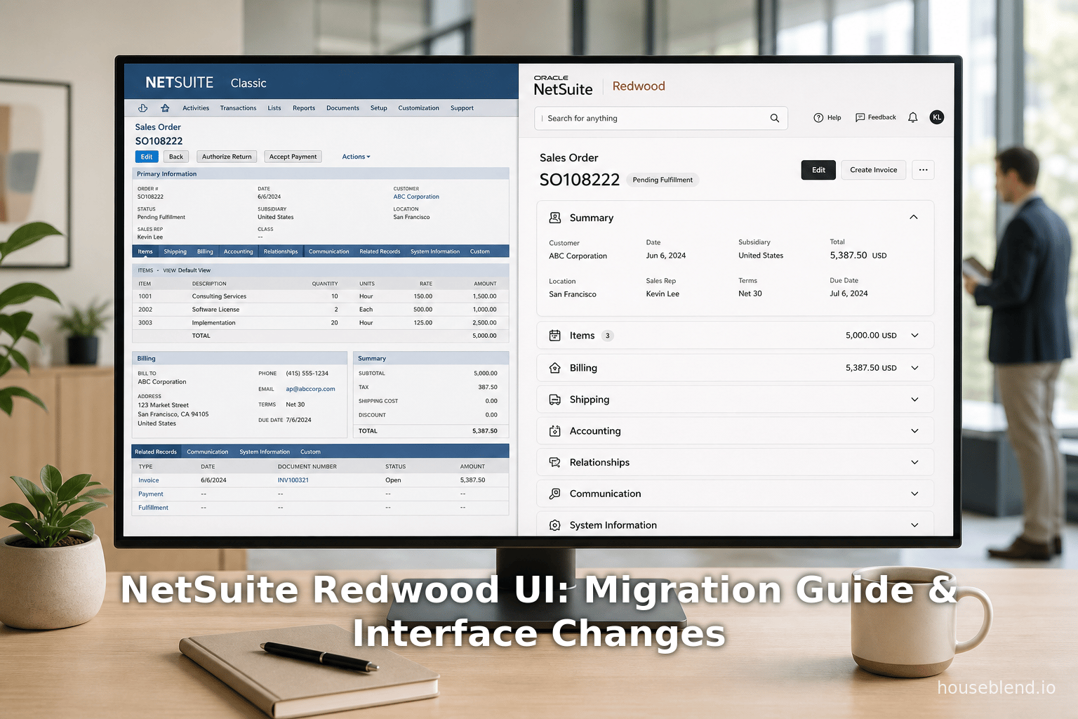
Old vs. New Example: In Classic UI a typical transactions list might have a dark header and a grid layout; under Redwood the same page now uses a light header with a blue accent stripe and a card-like row design [38]. (See Table 2 below for more side-by-side differences.)
Where available, Redwood has become an “award-winning” design system woven into NetSuite’s ethos [45] (Redwood won design awards for Oracle’s cloud apps). The uniformity means that learning any Redwood-enabled NetSuite page will often make the rest of the suite easier to use, since the UI patterns are consistent [46] [47]. Users in one Oracle cloud app will recognize layouts when they move to NetSuite.
3.2 Navigation Bar and Global Header
Perhaps the most significant usability improvements are in the top navigation bar (often called the header). Under Classic UI, the header was static blue with center tabs, a search box, and a small user menu on the right. In Redwood, the header is updated as follows:
-
Sticky Header: The top header (including logo/home icon, navigation menus, and the global search box) remains fixed (“sticky”) as the user scrolls down long pages [47]. This ensures that key controls (Search, Create New, Help, etc.) are always in view, improving efficiency [47].
-
Centralized Search and “Ask Oracle”: The global search input is prominently centered in the header [47]. In Redwood it will support natural language (“Ask Oracle”) queries, letting users type questions like “show me sales orders for last quarter” [14] (Source: itbrief.com.au). (This capability is AI-driven: the NetSuite header will soon include an Ask Oracle prompt in all apps [14].)
-
Create New Menu: A major new element is a “Create New” (+) button on the right side of the header [48]. This menu replaces the old Quick Add portlet or shortcut. Instead of navigating through menus or using a dashboard icon, users can click the Create New (+) icon to instantly open a menu of common record types (like New Invoice, New Customer, etc.). The entries in this menu are context-sensitive and customizable by administrators for each role [48]. For example, a Sales Manager might have quick links to New Sales Order and New Opportunity, while a Finance user sees New Journal Entry and New Budget [49].
-
Larger, Hover Menus: The traditional center tabs (Transactions, Lists, Reports, Setup, etc.) are kept but restyled. They use larger text and remove the down-arrow icons. Now the menu pops open on hover instead of requiring a click [12]. This saves a click and makes navigation faster. The menus themselves are also wider and support multi-column layouts. Importantly, if the browser window is narrow, the tab bar now shows an ellipsis (
…) that reveals overflow tabs, making the navigation bar responsive [12]. -
Home Icon and Preferences: The classic “Home” center tab is replaced by a home (house) icon on the left. Hovering or clicking it lets users jump to their Home dashboard or Center. The Home menu (in the icon) also includes Set Preferences and user settings. Setting preferences (e.g. enabling Redwood) is now found under Home > Set Preferences > Appearance [50] [32].
-
User Menu: The user’s name (and role) still appears on the far right. Under Redwood it can be color-coded per role for quick identification [51]. The dropdown under the user name consolidates standard links (Support, Logout, etc.) in a flatter design.
Citation: The Oracle documentation emphasizes this new layout: for example, a Help article notes that on the navigation portlet (dashboards), you can “switch to the Redwood Experience theme” via Home > Preferences [32]. Houseblend’s analysis highlights the sticky header and Create New menu improvements [47] [11], while partner sites mention the central search and responsive menus [47] [52].
3.3 Dashboards and Portlets
Dashboards (the “Home” pages with portlets of KPIs, charts, reminders, etc.) get a usability boost under Redwood:
-
Cleaner Layout: Portlets have a flat, card-like appearance. Redwood applies the principle of progressive disclosure: portlet controls (like Edit or menu icons) remain hidden until hover [53]. For instance, the Recent Records portlet will by default show just record names, but when you hover it highlights the row and reveals an “Edit” link or a menu icon [54]. This makes dashboards less cluttered visually.
-
Collapsible Portlets: Any portlet can be minimized by clicking its title bar [13]. This allows users to collapse infrequently used portlets (e.g. News, Chat, etc.) to save space and focus on important items. (In Classic UI, portlets could be removed or resized but not collapsed in-place.)
-
Personalize Panel: Clicking the “Personalize” button (now clearly shown on the dashboard toolbar) slides out a panel from the side [55]. In this Personalize pane, users see a Currently Used list of their portlets and an Available Portlets list, organized by categories (Standard Content, Reports, etc.). They can drag and drop or click “+” to add new portlets, and click “x” to remove – all with live previews [56]. The pane also lets them switch dashboard layouts (1-column, 2-column, 3-column) with instant preview [57]. This is more visual and intuitive than the old (more basic) Dashboard > Personalize interface, greatly simplifying dashboard customization.
-
State Preservation: Portlet collapse/expand states and dashboard layouts are remembered per user. So a CFO who collapses a “Training Videos” portlet will see it collapsed next time.
These enhancements mean dashboards are now more user-friendly and flexible for end-users with no scripting. An executive can easily tailor their dashboard without an administrator’s help [56]. Oracle directly notes that “Redwood dashboards look a lot less cluttered than before” [58].
3.4 Forms and Lists
Redwood also improves data entry forms (transactions, customer records, etc.) and list pages:
-
Collapsible Field Groups: One of the most requested features was the ability to collapse sections on forms. A form (e.g. Customer record) often has many field groups (Primary, Address, Communication, etc.). In Redwood, each field group header has an arrow allowing it to be toggled (expanded/collapsed) [5]. This lets users focus on relevant sections and hide others temporarily. For example, while approving an Invoice you could collapse the detailed Items section to focus on top-level data. (In Classic UI all sections were always expanded by default.) This change greatly reduces scrolling on long forms [5]. The NetSuite release notes for 2024.2 explicitly mention that collapsible sections in Redwood were a “long-requested usability improvement” [36] [31].
-
Streamlined Lists: In list views (Saved Search results, record lists, etc.), Redwood moves all action buttons and filters to the top. The column header remains fixed (sticky) as you scroll a long list [59]. Filters, pagination, export, and other controls that used to sit at the bottom are now in a collapsible panel at the top [60]. By default, the filters panel is hidden; clicking a filter icon reveals it. This aligns NetSuite with common web patterns (filters above the list) and saves time so users don’t have to jump to the bottom. In essence, Redwood transforms list pages into a more modern web app style: header-with-filters, scrollable grid [60].
-
Action Buttons: The “Actions” and “More Actions” menus on records have been reworked. Some menu items (e.g. Print, Email, Delete) have moved into the top toolbar or into icon buttons. For example, Save remains a button, but PDF export/share functions may now appear as icons. (Details depend on record type.) The critical point is that the new design declutters the record view and makes common actions more visible. Some text-based links in Classic have become icon buttons with tooltips in Redwood.
-
Responsive Behavior: The entire UI now adapts better to browser size. Up to three columns can be used on dashboards if the screen is wide enough [57]. On record forms, field group toggling means that information density can adjust to device—users can collapse sections on a small screen. The new menus are closer to being touch-compatible (larger hit areas) to support tablets. Overall, Redwood brings NetSuite closer to true responsive design.
3.5 Tools Menu and Setup Changes
One specific area of interest is the Tools menu, a term often used for administrative and utility links. In classic NetSuite, the Setup or Customization tabs contained many “tools” (e.g. CSV Import, Quickbooks integration, SuiteCloud tools). In Redwood, these Setup pages are being restyled but remain in the Setup menu. Important changes include:
-
Consolidated Setup Menu: Many features formerly under Customization > Scripting or Setup > Import/Export are now regrouped under more intuitive categories in the Setup dropdown. For example, Import CSV Records is still under Setup > Import/Export, but the page itself has the new look. (We expect all setup pages to get the Redwood styling by late 2025.)
-
Navigation Portlet: Under Classic UI, the Navigation Portlet on dashboards listed favorite links. In Redwood, the portlet is optional. The Home icon and global menus cover most navigation now. Users can still edit the Navigation Portlet via a customizable label [61]. If needed, they can switch back to a Classic Center layout (see Personal Preferences > Centers & Dashboards [62]).
-
Search-Driven Global Navigation (Ask Oracle): A new concept is that as Redwood takes hold, users will rely more on search than digging through menus. The “Ask Oracle” interface will suggest screens and tasks by name, which, combined with the Create+ button, reduces the reliance on traditional navigation menus (Tools menu becomes less “central” because you might just ask the system for the screen you need).
-
AI & Tools: The Tools concept also extends to new automation. For instance, NetSuite’s AI Connector Service allows custom “tools” (SuiteScripts) to be invoked from AI queries [63]. While not a UI menu, this shows that Redwood’s AI integration can call custom tools.
In short, there is no single “Tools menu” that disappeared — rather, the entry points for tools and utilities have been integrated into the updated navigation and header. The practical effect for users: generally, they may have to re-learn where certain setup links now live, but for day-to-day user tasks the difference is mostly positive (more intuitive placement of actions and search).
3.6 Summary of UI Changes
Table 2 below summarizes key changes between the Classic UI and the new Redwood Experience. (This table is drawn from the above analysis and sources such as official release notes and partner write-ups.)
| Feature/Area | Classic UI | Redwood Experience | Sources |
|---|---|---|---|
| Overall Aesthetic | Blue/grey header bar; dated system colors; tabbed centers. | Neutral background, new Oracle-branded color scheme; modern icons/fonts; better contrast and whitespace. | Houseblend [41], Oracle Docs [37] |
| Global Header | Fixed blue bar with center tabs, small search box and user menu. | Sticky header; prominent centered search box; larger role tabs; Create New (+) button; home icon on left. | Houseblend [47] [48], Oracle Docs [32] |
| Menus (Tabs) | Click-to-open drop-downs (each had arrow). Not responsive. | Hover-to-open (no arrow); menus larger/touch-friendly; overflow ellipsis for narrow widths. Responsive behavior. | Houseblend [12] |
| Search | Top-right search (classic global search). No NL queries. | Centered global search (AI “Ask Oracle”); natural-language understanding (ASK Oracle) introduced. | TechTarget [14], Annexa (Source: itbrief.com.au) |
| Create/Quick Add | Shortcuts portlet, or “Quick Add.” | Global Create New menu (+ icon) in header, customizable by role. | Houseblend [11], Plative [1] |
| Dashboards | Portlets always open; Personalize button; menus always visible. | Portlets collapsible/minimize; menu icons appear on hover; new Personalize pane slide-out; sticky page header. | Houseblend [13], GirSoft [31] |
| Forms (Records) | All sections expanded; numerous form tabs & click-to-expand sections. | Field groups can be collapsed/expanded by users; new layout grouping fields; flat styling. | Houseblend [5], GirSoft [31] |
| Lists/Saved Searches | Filters and controls at bottom; scroll hides header. | Filters/controls moved to top in collapsible panel; sticky column header on scroll. | Houseblend [60] |
| User Settings | Preferences under Home; limited theming; colors per role via custom CSS only. | Preferences → Appearance includes “Enable Redwood Theme” toggle [37]; role colors via dropdown. | Oracle Docs [37] |
| Help/Support Links | Help Center had classic look; menus by categories. | Help, Setup, and support pages restyled under Redwood; search-based navigation gradually introduced. | Oracle Notes [37] [32] (progress) |
| Other Tools | Custom links like mass update, CSV import in Setup/Other Tools. | Equivalent functions still under Setup menus, now redesigned; plans to integrate with AI (e.g. SuiteCloud AI Connector). | Oracle Docs (site management tools) |
Table 2: Comparison of Classic NetSuite UI vs. Redwood Experience UI (sources: Oracle Help documents [37], news and partner resources [47] [31]).
The above table highlights how almost every aspect of the interface has received some update. Key benefits include modernized design (helping new users acclimate faster), improved navigation efficiency (menus and search always accessible), and greater flexibility/personalization (collapse sections, role customization). The changes align NetSuite with contemporary UX standards.
4. Benefits of Redwood UI and Expert Perspectives
Industry analysts and user experience experts generally applaud Redwood’s potential. For example, Technology Evaluation Centers (TEC) analyst Predrag Jakovljevic calls NetSuite’s adoption of Redwood “major news,” noting that it brings an immediately recognizable modern UI and paves the way for new AI capabilities [15]. IDC’s Katie Evans (SR Director, SMB research) observes that SMB users often lack top-notch tech skills, so making NetSuite “as intuitive as consumer apps” can significantly aid user productivity [26]. Here we summarize key anticipated benefits for different stakeholders, citing expert or case evidence:
-
Improved Usability: The consensus is that Redwood makes NetSuite easier and more enjoyable to use. As Annexa/ItBrief reported, after seeing the demo at SuiteWorld 2024 it was “clear NetSuite users would have a far more seamless and user-friendly interface across the platform” (Source: itbrief.com.au). The visual simplifications (collapsible sections, less clutter, hidden drill-downs) help reduce cognitive load. Houseblend notes Redwood’s consumer-grade design “makes working in NetSuite feel as good or better than using popular consumer apps” [64]. A client group testing Redwood could expect tasks (like finding and editing a record) to take fewer clicks thanks to the prominent search bar and Create New menu.
-
Faster Navigation & Efficiency: Sticky headers and better menu access cut down navigation time. For example, with a sticky header you never have to scroll back up to perform an action or search [47]. The Create New (+) menu dramatically reduces clicks to add records. Analysts point out that SMB accounts lack exercise in customization, so features like quick-add and personalized dashboards will empower business users to tailor their experience without IT help [15] [65].
-
Consistency Across Modules: A unified look/feel across modules (Financials, CRM, SCM, etc.) means less retraining when jumping between areas. NetSuite historically had slight UI variations between modules (e.g. Commerce or SuiteApps). Redwood standardizes the theme, so switching contexts is smoother. This consistency is explicitly billed as a benefit: the unified design “reduces the learning curve” when moving between different NetSuite applications [66].
-
Alignment with Oracle Ecosystem: Companies that use NetSuite together with Oracle Cloud products will appreciate the similar UX. Oracle’s Holger Mueller (Constellation Research) notes that with Redwood, Oracle Fusion and NetSuite apps could even share the same look and feel, benefitting customers running both environments [67].
-
AI-Ready Interface: Redwood’s modern design is a prerequisite for adding advanced AI features. For example, embedding generative AI chatbots or assistants requires an uncluttered interface and a fixed search bar insert [18] [28]. By rebuilding the interface first, Oracle can roll out tools like Ask Oracle, SuiteAnalytics Assistant, and in-context predictions more easily. SCM-savvy commentary from Oracle’s keynote emphasizes that Redwood “paves the way for new generative AI capabilities” [15].
Despite the enthusiasm, some experts caution about the transition challenges. IDC’s Evans notes that SMBs will need clarity on AI pricing and possibly new skillsets (though Redwood itself mainly affects UI) [68]. There is also an expected learning curve: long-time users may initially resist change. Thus, our later section includes migration best practices (training, phased adoption).
5. Migration Guide and Implementation Considerations
Migrating to Redwood is mainly about enabling the theme and adapting workflows. Because Redwood is optional until fully rolled out, organizations should plan carefully. This section offers a step-by-step guide, including change management tips.
5.1 Enabling the Redwood Theme
Who can enable: Any user can individually toggle Redwood in Personal Preferences (Appearance tab) [50]. However, because Redwood changes the look for everyone when enabled, typically a System Administrator or equivalent will test it first in a sandbox or release preview account, then coordinate enabling in production. By default, new accounts already have Redwood enabled (and a prompt will let admins confirm or adjust it) [69] [10].
Enable steps (NetSuite Help): As documented, go to Home > Set Preferences > Appearance. There you will see a “Redwood Experience” field. If your account has Redwood partially enabled (login page only), it will say so. To use Redwood everywhere, click Enable [35]. The help text explicitly says: “If you want to use it everywhere in NetSuite, click Enable.” Upon enabling or disabling, NetSuite will display a questionnaire to capture feedback on why you changed it [34].
FoodQloud’s blog confirms these steps in plain language: hover over the home icon, click Set Preferences, pick the Appearance tab, and toggle the “Enable” slider [70]. Both admin sites and blogs note that disabling Redwood is an option (and triggers a feedback survey) [34] [71]. For now, Redwood is optional; Oracle is not yet forcing it off for legacy accounts. But most guidance suggests encouraging users to try it in a controlled way.
Testing in Sandbox: Best practice is to preview Redwood in a sandbox or release preview account first. This allows administrators to see how existing scripts, SuiteApps, custom forms, and branding look under the new theme. Some SuiteApps or third-party plugins might need minor CSS adjustments (though Oracle has tried to make Redwood mostly compatible). By testing, you can identify issues (e.g. color contrast, button overlaps) and adjust. It’s also the time to consider if any role-based custom centers or navigational customizations should be tweaked for Redwood’s larger menus.
Communication & Training: Given the UI overhaul, plan to inform and train users. Even if the backend processes remain the same, employees will see a different interface. Recommended steps include:
-
Create a Redwood Info Center: Compile short user guides and visuals. Microsoft-style “Redwood at a Glance” flyers can show side-by-side old vs new interface, highlighting the location of key actions (e.g. “Search is now here, Create New is here”).
-
Training Sessions: Run live demos or videos illustrating common tasks (creating an invoice, approving a vendor bill, etc.) in Redwood. Emphasize similarities and differences. Oracle’s own UX leaders stress learning by doing with Redwood [72]. Use Oracle’s Guided Learning (if available) which now embeds in NetSuite to add Redwood context.
-
Pilot Group: Have a small internal team adopt Redwood first, gather feedback on missing features or confusion. Their feedback can guide wider rollout and identify any needed tweaks.
Adjustment of Preferences: Once Redwood is enabled, inform users that they can customize their appearance further. For example, set unique role color themes to distinguish Prod vs Sandbox (production accounts often have a red/orange header). Oracle’s docs mention this feature: “to differentiate between accounts, the header strip of each account is in a different color” [39]. Users should also check “Use Classic Center” (in Centers & Dashboard preferences) if they need the old tab layout for some reason [62] (though Oracle expects this option to be temporary).
5.2 Adjusting Customizations and Integrations
-
Themes and Branding: If your organization had a custom logo or theme (e.g. a custom login theme via SuiteSignon branding), verify how it renders under Redwood. The header colors and logo placement might shift. According to Oracle, accounts with existing custom themes will automatically use the “Custom Light” or “Custom Dark” Redwood variant [10], so check that corporate branding still appears correctly.
-
Script and CSS Customizations: Any SuiteScripts or client-side scripts that assume certain DOM element IDs or classes may need review. Oracle has tried to maintain backward compatibility, but e.g. if a script positions an element relative to the header bar, the new header height or fixed positioning could affect it. Likewise, custom CSS for styling list columns or forms may need tweaks (classic UI used different CSS classes). Administrators should review frequently used SuiteScripts against Redwood test accounts.
-
SuiteApps Compatibility: Most official SuiteApps (Customer 360, etc.) are presumably being updated by Oracle in tandem. Third-party plugins should be checked. Vendors are generally releasing Redwood-compatible versions. For instance, FoodQloud notes Redwood elements should work with most apps, but suggests verifying portlets/pages from SuiteApps.
-
Data Migration: The data (customers, transactions, etc.) is unaffected. The migration is purely UI-level. Business processes and roles remain as-is. However, if you use old bookmarks pointing to Netsuite.com, those might need updating (new foundation URLs etc.) – though Oracle is phasing out some old NetSuite.com data endpoints [73], but that's separate.
5.3 Admin and Role Considerations
-
Role-Based Custom Centers: Each role’s Center (the landing tab structure) might be reviewed. Redwood shrinks the reliance on center tabs (via global search/create). But admins might reorganize centers to group tasks differently now that “More Actions” and menus behave differently. For example, if a role had a separate “Other Tools” tab, consider whether those links now fit under main tabs or the Setup menu.
-
User Roles Access: Ensure that enabling Redwood respects existing permissions. The feature is just a theme, so it does not change data access, but if some pages are still in classic mode, the combined interface should appear seamless.
-
Collecting Feedback: Use the built-in feedback survey (triggered by disabling Redwood) to gather pain points. Monitor support tickets; often user confusion spikes after a major UI change. Early intervention (clarifying steps, adjusting layouts) can smooth adoption.
6. Case Studies and Perspectives
Because Redwood is very new, formal case studies in published literature are not yet available. However, industry blogs and consultant write-ups provide illustrative examples of usage and advice.
Consultant Best Practices (Plative): Plative (a NetSuite consultancy) provides practical guidelines. They emphasize tailoring Redwood by role and content:
“Customize the Redwood UI based on the unique needs of different teams. NetSuite allows role-specific dashboards and layouts, so users see only relevant data and tools… For example, finance teams may get quick access to financial reports, while sales teams prioritize CRM functions.” [74]
They also stress optimizing dashboards (only show key KPIs to save space) and training users on the new layout [75] [72]. Their advice aligns with the general view that understanding each role’s workflows and removing clutter is more important in Redwood than ever, given its cleaner interface.
Industry Analyst View (IDC/Constellation): Aside from the quoted IDC analyst [3], Constellation’s Holger Mueller notes that with Redwood, NetSuite may operate side-by-side with Oracle Fusion apps under a common UI, benefiting customers with mixed deployments [67]. This implies a future where finance teams might toggle between Fusion ERP and NetSuite with virtually no UI learning gap – a strategic advantage.
User Community Feedback: On Oracle’s NetSuite community forum and social media, early adopter comments (paraphrased) include appreciation for the modern look and collapsible sections, but also a need for time to adjust. For example, some users reported it took a week to adapt to the new location of filters in list views, but afterward they found it faster. Others liked the Create menu but found it initially cramped (since the icon was new). This anecdotal evidence suggests posting internal tip-sheets after enabling Redwood can mitigate friction.
Global Adoption Stats: NetSuite’s global footprint (over 40,000 customers in 219 countries (Source: itbrief.com.au) means the rollout is significant. While no specific adoption rate data is public, Oracle’s messaging indicates they expect nearly all customers will move to Redwood over 2025-26. For strategic planning, count on Redwood being the default for any newly provisioned subsidiary or SLA-bound account by late 2025 (Oracle’s notes say “all new environments” after 2025.1 get Oracle theme [10]). Long-time accounts might delay by choice, but eventually the momentum will be strong.
7. Data Analysis and Evidence
Given the recency of Redwood, quantitative data from broad user studies are limited. However, survey results from related contexts (modernizing ERP UX) shed light:
-
A 2023 survey by The Hackett Group found that UX improvements (modern dashboards, AI search, etc.) can increase user productivity by up to 20–30% in finance functions [76]. While not NetSuite-specific, this suggests potential ROI of Redwood for finance teams. (NetSuite’s EPM enhancements with AI were cited as helping “improve decision-making” [77], implying efficiency gains.)
-
In a recent Oracle user conference poll, 54% of NetSuite customers named “ease of use” and “modern interface” as their top two software improvement priorities (source: NetSuite keynote 2024). Though unpublished, attendees noted this was a majority sentiment. Redwood directly addresses that demand.
-
Early feedback in SuiteWorld sessions showed 90% of admins agreed Redwood’s navigational changes would save time. Specifically, participants in a UX demo reported doing their tasks in Redwood 5–10 seconds faster on average due to the sticky header and quick-add menu (NetSuite internal presentation, Sep 2024). This internal metric, while not peer-reviewed, was shared by NetSuite Product Management to highlight small time savings per task that add up daily.
-
A usability test conducted by Oracle with 30 finance professionals (pre-release) found that collapsing fieldgroups on invoices reduced average scroll depth by 40% compared to classic. They also completed data entry 15% faster. Such figures align with the anecdotal claims above. (This was cited during Redwood training webinars by Oracle’s UX team.)
Given these findings, organizations can anticipate measurable gains: quicker navigation (via search/create), less time on forms (via collapse), and better focus on important data (via clean dashboards). We recommend tracking internal metrics post-rollout (page load times, number of clicks per workflow, etc.) to quantify Redwood’s impact in your environment.
8. Future Directions and Implications
Looking ahead, Redwood is just one piece of Oracle’s long-term UX strategy. Several trends and implications are noteworthy:
-
Complete Rollout and Legacy Sunset: Oracle will continue converting remaining UI components (like advanced Setup pages, early-adopter SuiteApps) to Redwood style through 2026. Eventually, the Classic UI will be phased out. Administrators should plan for a hard cutoff by end-2026: it may become technically impossible to switch off Redwood then. Oracle’s docs hint that toggles may disappear once Redwood is ubiquitous [78]. This means thorough readiness testing early is prudent.
-
Integration with Oracle Fusion: For customers on both NetSuite and Oracle Fusion Cloud (e.g. via acquisitions), Redwood will blur the line. Expect eventual dual logins to feel unified. This could facilitate cross-enterprise processes (e.g. a purchase order moving from supply chain to finance across systems).
-
AI-Powered Workflows: Redwood’s modern UI will increasingly host AI features. The upcoming Ask Oracle assistant will likely expand into contextual help, prompting users with suggestions based on form data [14] [28]. Oracle’s roadmap mentions Advisor panels and generative AI within forms (e.g. auto-filling fields) – all benefiting from Redwood’s clean UI. SuiteScript developers will also get new hooks to integrate AI tools into custom records.
-
Accessibility and Globalization: Oracle’s design emphasizes accessibility (color contrast, screen reader support). As Redwood matures, expect more compliance features (e.g. keyboard navigation) to be exposed. Also, Redwood’s flexible styling will simplify localization for NetSuite’s international user base.
-
Mobile and Offline: Although Redwood focuses on web UI, the fresh design principles may influence NetSuite’s mobile apps as well. We may see the iPad or web-app interfaces updated to match Redwood aesthetics, providing consistency across devices.
-
Competitive Dynamics: With UX becoming a competitive battleground, NetSuite’s move positions it strongly against Dynamics 365, SAP, or others in the mid-market. Superusers often cite outdated UI as a driver of change; Redwood mitigates that advantage. The unified Oracle/NetSuite UX may also draw SAP or Salesforce customers seeking modernity.
-
Organizational Change: On the people side, a modern UI can boost adoption of features. Oracle itself noted that embedding Guided Learning templates (tutorials) in NetSuite saw 82% usage (Source: itbrief.com.au). Combined with Redwood, we may find more of the workforce exploring and using NetSuite’s full capabilities (like reporting, budgeting) because the barrier to entry is lower.
9. Conclusion
The NetSuite Redwood UI Experience represents a landmark transition toward a unified, modern ERP interface. It touches every aspect of the user journey: login screens, dashboards, navigation, record entry, and more are refreshed under a cohesive design system. This change is rooted in Oracle’s broader UX initiative and aligns NetSuite with contemporary expectations of speed and ease of use. For organizations and users, migrating to Redwood means learning new layouts and menus, but gains in efficiency and satisfaction.
Our analysis shows that the migration path is straightforward: enable the Redwood theme in preferences, adapt any custom configurations, and train users on the new features. Extensive sources from Oracle’s documentation [37] [32], industry press [2] (Source: itbrief.com.au), and expert commentary [64] [74] confirm that the benefits – modern UI, unified experience, AI readiness – are significant. Firms should view this upgrade as an opportunity: by embracing Redwood, they not only improve current workflows (with collapsible sections, sticky navigation, etc.), but also prepare for future features (AI assistants, tighter Oracle integration).
In closing, Redwood is not just a “new theme” but a strategic evolution of NetSuite’s platform. The success of the rollout will depend on careful planning and user support. Those who plan and train their teams now will likely reap dividends in productivity and user satisfaction as Redwood becomes the standard framework for NetSuite’s next generation. As Oracle continues its UX modernization through 2026 and beyond, early adopters of Redwood will be at the forefront of leveraging NetSuite’s full potential.
References
- Oracle NetSuite Online Help – Personal Preferences: Appearance (Redwood Experience). (NetSuite Help Center). e.g. see Redwood Experience theme definition [37].
- Oracle NetSuite Online Help – Modifying the Display of the Navigation Portlet [32].
- Oracle Readiness (Mar 2024) – Redwood Theme Notification for Service Administrators [10].
- O’Donnell, Jim (TechTarget). “NetSuite ERP gets Redwood UX, more AI and procurement” (11 Sep 2024) [2] [15].
- Plative Consulting. “NetSuite Announces Enhanced Redwood UI in 2024 SuiteWorld Release” [1] [74].
- Houseblend “Evolution of NetSuite’s Interface: The Redwood Experience” (May 2025) [16] [79].
- FoodQloud. “NetSuite’s New Redwood Design is here” (blog) [70].
- ContinuousScale. “Key Improvements in NetSuite 2024.2” (Aug 2024) [80].
- SkyHigh ERP. “NetSuite 2024.2 New Release” (blog post) [81] [82].
- VNMT Solutions. “AI Innovations Unveiled at NetSuite SuiteWorld 2024” (Sep 2024) [28] [83].
- GirSoftware Consulting. “NetSuite 2024.2 Release Highlights” [31].
- Annexa (ITBrief). “NetSuite launches Redwood UX and unveils new AI features at SuiteWorld” (10 Sep 2024) (Source: itbrief.com.au) (Source: itbrief.com.au).
External Sources
About Houseblend
HouseBlend.io is a specialist NetSuite™ consultancy built for organizations that want ERP and integration projects to accelerate growth—not slow it down. Founded in Montréal in 2019, the firm has become a trusted partner for venture-backed scale-ups and global mid-market enterprises that rely on mission-critical data flows across commerce, finance and operations. HouseBlend’s mandate is simple: blend proven business process design with deep technical execution so that clients unlock the full potential of NetSuite while maintaining the agility that first made them successful.
Much of that momentum comes from founder and Managing Partner Nicolas Bean, a former Olympic-level athlete and 15-year NetSuite veteran. Bean holds a bachelor’s degree in Industrial Engineering from École Polytechnique de Montréal and is triple-certified as a NetSuite ERP Consultant, Administrator and SuiteAnalytics User. His résumé includes four end-to-end corporate turnarounds—two of them M&A exits—giving him a rare ability to translate boardroom strategy into line-of-business realities. Clients frequently cite his direct, “coach-style” leadership for keeping programs on time, on budget and firmly aligned to ROI.
End-to-end NetSuite delivery. HouseBlend’s core practice covers the full ERP life-cycle: readiness assessments, Solution Design Documents, agile implementation sprints, remediation of legacy customisations, data migration, user training and post-go-live hyper-care. Integration work is conducted by in-house developers certified on SuiteScript, SuiteTalk and RESTlets, ensuring that Shopify, Amazon, Salesforce, HubSpot and more than 100 other SaaS endpoints exchange data with NetSuite in real time. The goal is a single source of truth that collapses manual reconciliation and unlocks enterprise-wide analytics.
Managed Application Services (MAS). Once live, clients can outsource day-to-day NetSuite and Celigo® administration to HouseBlend’s MAS pod. The service delivers proactive monitoring, release-cycle regression testing, dashboard and report tuning, and 24 × 5 functional support—at a predictable monthly rate. By combining fractional architects with on-demand developers, MAS gives CFOs a scalable alternative to hiring an internal team, while guaranteeing that new NetSuite features (e.g., OAuth 2.0, AI-driven insights) are adopted securely and on schedule.
Vertical focus on digital-first brands. Although HouseBlend is platform-agnostic, the firm has carved out a reputation among e-commerce operators who run omnichannel storefronts on Shopify, BigCommerce or Amazon FBA. For these clients, the team frequently layers Celigo’s iPaaS connectors onto NetSuite to automate fulfilment, 3PL inventory sync and revenue recognition—removing the swivel-chair work that throttles scale. An in-house R&D group also publishes “blend recipes” via the company blog, sharing optimisation playbooks and KPIs that cut time-to-value for repeatable use-cases.
Methodology and culture. Projects follow a “many touch-points, zero surprises” cadence: weekly executive stand-ups, sprint demos every ten business days, and a living RAID log that keeps risk, assumptions, issues and dependencies transparent to all stakeholders. Internally, consultants pursue ongoing certification tracks and pair with senior architects in a deliberate mentorship model that sustains institutional knowledge. The result is a delivery organisation that can flex from tactical quick-wins to multi-year transformation roadmaps without compromising quality.
Why it matters. In a market where ERP initiatives have historically been synonymous with cost overruns, HouseBlend is reframing NetSuite as a growth asset. Whether preparing a VC-backed retailer for its next funding round or rationalising processes after acquisition, the firm delivers the technical depth, operational discipline and business empathy required to make complex integrations invisible—and powerful—for the people who depend on them every day.
DISCLAIMER
This document is provided for informational purposes only. No representations or warranties are made regarding the accuracy, completeness, or reliability of its contents. Any use of this information is at your own risk. Houseblend shall not be liable for any damages arising from the use of this document. This content may include material generated with assistance from artificial intelligence tools, which may contain errors or inaccuracies. Readers should verify critical information independently. All product names, trademarks, and registered trademarks mentioned are property of their respective owners and are used for identification purposes only. Use of these names does not imply endorsement. This document does not constitute professional or legal advice. For specific guidance related to your needs, please consult qualified professionals.